Category Archives: Graphic Design

Design Reminders

… gleaned from Tony’s feedback for our presentations…

The highest point of contrast should be the subject (remembering that as objects fade in the background, so does the contrast). Use the illusion actively to emphasize the focal point.

Legibility matters. (the above can help.)

Art deals with the “the gift exchange” conundrum, the politics of giving, and how people don’t want to be indebted (if they are getting something from you, they will feel that.) (This was in reference to free art on the street, and people’s initial resistance to it.)

If possible, keep the presentation short enough for the audience to get the message, and no more (reduce info saturation, increase potential action).

All you need is a little imagination and a little effort, and you’re good to go.

A common problem: dealing with images and getting text to read. A potential solution: when shooting images, have the text already in mind – create a place for it.

Desire & Design

Don’t get caught in the sex trap. Desire can mean a whole lot more than just sex, just as pleasure can come in millions of different forms, see?

pure pleasure, with a pack of Newports

Sooo…. what do we really want?

Tony outlined FOUR general themes, namely Adulation – the admiration of others, and how being admired by others can be a bottomless drive for some more than others – the stronger the desire for it, the less possibility of eventual fulfillment; Sex – bringing with it issues around pleasure, lust, power, acceptance, intimacy and attraction; Completion – the ultimate feeling of satisfaction and wholeness (this can touch at spirituality); Food – the fuel of life and that which we use in times of celebration as well as in times of needing comfort (cigarettes, alcohol and drugs can fit in here as well, I think – fillers of the void).

lots of issues here... magazine covers are strategic about their placement of information and leading titles

The id, the ego, and the super ego, according to Sigmund Freud….

The id being our basic desires and fears with no sense of censorship… the ego being the connection to reality and trying to work between the id & reality (and later the super ego too)… a deal-maker…. and the super ego being the conscience… getting into the morality of desires and their fulfillments.

Designers play with these concepts all the time. If what the id wants isn’t possible in the moment, the ego (or the designer) will come up with an alternative. For a brief time it may satiate the desire, but it won’t last and the desire will come back. If the ego (or the designer) did a really good job, the desire will go directly to the replacement item…. another donut, or creamy yogurt… and the super ego supervising all along.

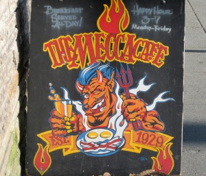
The sidewalk sign below, just outside the Mecca Cafe, is an example of the mind games that go on between the id, who wants the greasy breakfast and beer, and the ego, who is saying they need to be careful of their weight, and their cholesterol, etc,,, and of course the whole play on the devil and the reference to temptation, and notice the eggs and bacon look like a skull & crossbones…

Oh, I want that! Oh no, I shouldn't. Oooh ok, I will..... maybe just this once!

Never give them something they want. Give them a portion of what they want so they’ll come back. (this totally makes sense to me, but I still don’t really understand where the over-serving of food at restaurants comes into this formula.)

As further outlined in class, “in design, we are “PROMISED”…

… to be like something via its acquisition or like the person using it. (as in this Japanese ad for Roots coffee with Brad Pitt)

…to gain sex and/or power through acquisition. (as in this ad for L Perfume by Gwen Stefani – don’t miss the end :))

… that the wanting itself is to be desired (contradicting the wanting to feel complete). (as in this ad for Vios, Toyota)

…that we will be free of desire via acquisition”… or we’ll get over it, or our super egos will come and tell us to simmer down, (as in this Coke Lite ad)

… and we are promised….a GOOD TIME!!!

join beauties in a tropical feel of paradise, right here in rainy, grey Seattle

Hula Hula!!

So, given all these promises, can you buy Adulation and Sex, Completion and Satisfaction? It often appears that way.

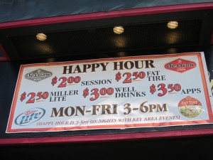
You can be in paradise with the pretty hawaiian girls by doing karaoke at Hula Hula on First Street N in Queen Anne. You can buy happiness in many restaurants and bars from 3-6pm. This week in the Seattle Weekly, there is an entire booklet guide dedicated to Happy Hours around the city.

buy "happy" for a couple of hours

You can experience romance, just by wearing a particular perfume (Chanel Perfume ad -Nicole Kidman)

nice placement of the bottle, right by her mouth, and it's called, Juice?

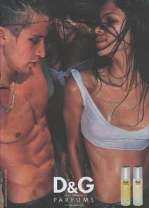
Magazine-ads.com has a whole slew of advertisements with all of the above issues highlighted… here are some examples… not too subtle…

With the Op ad, note the position, shape, color and direction of the bottle, and note her free and happy feeling. With the D&G add, well, you can imagine for yourself.

Anthropomorphic designs can play both ways – that bottles or machines acquire human shapes or emotions, or that humans acquire object-like characteristics. This works with the perfume bottles, as well as motorcycles, or cars. It has been commonly used in movies, such as “Finding Nemo” and the “Toy Story” series.

no explanation necessary

Then of course there is the Oedipus complex – referring to the story of poor old Oedipus Rex who is put out to the elements to die as a baby, due to his ill-fated destiny… his destiny being to sleep with his mother, and to kill his father. He runs away from his adoptive parents (he thinks they are his blood parents) to avoid that happening, but then makes his way unknowingly to his real parents….

As a baby, we learn about pleasure and aversion in non-sexual ways, and once we become sexual, it’s hard to separate back to those former times, thus confusing things, such as did Oedipus. Haven’t totally figured out how this fits into design strategy.

The last idea we talked about was that of Mastery…

…being the idea of trying to fix something that has already happened, and is therefore unchangeable. From this concept comes the repeating patterns of self-destruction and experiences that we wish we could have fixed when we were little (or beyond).

This touches on the darker side of the human struggle… that plays to all of the themes above… especially to adulation….

classic, at the grocery check-out

So in these design works, the goal is to give people the “PROMISE” (maybe not a real promise, but a darn convincing one) of completion, not the actual completion itself….. so that you catch people at the beginning of the feeling of desire, when they are most interested….

Hornitos - 100% Pure Agave, Purer than Your Intentions (Seattle Weekly)

User Interface – UI

WoW!!!! User Interface (interaction between humans & machines) is going nuts.

In watching John Underkoffler describe the future of UI, with full body interaction with 3d computer graphics, becoming not just something for lab technicians, but for the common person, it speaks to the speed of change in the quickly-evolving industry. Since the beginnings of Apple in the early 80’s the development of computers has been exponentially fast… expansion of memory and increase in processing speed, as well as the capabilities of the systems themselves. It’s pretty amazing.

Aurora is another example of the potential future of user interface, where two users in different geographical locations can interact together, sharing documents and bringing documents/information to each other’s computers.

Currently user interface is best exemplified on the computer and the internet, as well as in touch-screen kiosks, and mobile applications (apps). Zivelo demonstrates the varying uses of kiosks for customer use. Data visualization plays a large role in making raw data accessible, and Visualizing.org has a great series of examples of the potentials of visualization, when it comes to organizing data in a way that users can understand.

The interface for app design is as much about spacial relationships as about the look and feel – it sets up the basic rules for engagement…. designing the look and feel and basic and consistent navigation (knowing where you are and how to go back a screen, or home.)

music app from usabilitypro.com

The apps are also going nuts, just looking at Apple’s selection, there are over 350,000!!!! to chose from.  Anything from tracking your period, to the tides, to getting in shape and tracking your heartbeat, as well as organizing the logistics of your favorite sports team. Although some of them, it’s hard for me to tell what they do, because there’s no description – it just says “download now!” There is a website where you can create your own app… www.magmito.com. They “Include: text, images, graphics, video, maps, backgrounds, quizzes, forms, RSS feeds, direct-dialing,web linking, custom on-phone icons, and more!”

Before this class, this is what I knew about apps:

As Tony described in class, “App design demands some basic functionality.”

Here is what he suggests, in designing an app….

1. Pick a project

2. Determine all information deemed needed

3. Determine what goes on what page

4. Note how the pages link

5. Determine how one stays oriented

There are rewards for the high quality of design, innovation and usability of these clever apps… Apple Design Awards, Webby Awards (with Lisa Kudrow next week!!), etc. check’em out!

Going Viral…. since last week

So the viral project continued… and I finished the stickers. I decided on three final ones that said, “I’ll take it raw,” “raw is hot,” and “raw not war.”… based on the colors that I had gleaned from the previous research.

To make them, I cut out some paper stencils…

And created sheets on paper to photocopy:

Then took them to Fed-Ex to copy those sheets onto sticker paper and cut them up into individual stickers:

We took the stickers to KFC and Taco Bell, where we posted a few stickers, and found the only raw thing on the menu was coleslaw. :o) We got plenty of stares, but no direct comments. Here is the film… (both my first video and my first time posting on Youtube.)

http://www.youtube.com/watch?v=_DImlb_88f4

They didn’t go viral at KFC/Taco Hell. I think to find out if these would spread I would need to go back to the original restaurants I did the research with, where there is a higher probability of more interest. Then, once that got going… I could go back to KFC/TB and throw a few in the chicken buckets.

Going Viral

This is a work in progress…

Research…

In brainstorming for this viral project, focusing on the idea of making one or multiple stickers, I thought about collection stickers, where kids could collect different instruments that made up a band – I was thinking specifically of Ozomatli because they have so many instruments… or some other form of collection of varying stickers with the same theme… but it was too complicated – viral needs to be more simple.

Then I moved on to the idea of PSAs… I thought of Leave No Trace, but passing out a bunch of stickers would contradict the idea of managing waste well. Moving on to another theme – one of the events important to me that is currently hot right now is the debate of the potential damming of wild rivers of Chilean Patagonia in southern Chile. It’s an amazing wild place and would be destroyed in many ways by having its two largest rivers blocked with 5 dams and further extended by 2,300 kilometers of 70-meter-tall high-powered towers to get the energy to the north of the country. Here are some pictures that exemplify its magnificence:

Patagonia_Desconocida

I did extensive research on images, the movie “Patagonia Rising” that came out this May and is coming to San Francisco next week, and the depths of the campaign… and then guess who I found…. yes, Shephard Fairey, the original viral man himself, and he had already made a poster… so I decided to back off….

Shepard Fairey for Patagonia sin Represas (Patagonia without Dams)

I wanted a topic that was new and fresh and in action, so….another topic that has become interesting to me recently is the Raw Foods movement. It has unquestionable health benefits and is relatively new to Seattle. My approach was to help raise the awareness of raw foods, as a public service announcement idea. There are only a handful of raw foods restaurants and juice bars, and they seemed like a good place to start finding out more. They were already in it! So I went to visit these places, and spoke to the managers to get more information on the clientele, colors, symbols and background.

The four places I looked into were Thrive, Chaco CanyonThe Juicy Café, and Healeo. In their decor the former two have a more earthy grounded feel of browns, and the later two have a more light green and airy feel. Their websites are mostly consistent with their stores’ look, except for Thrive, that is super bright on the web, but more demure in its establishment.

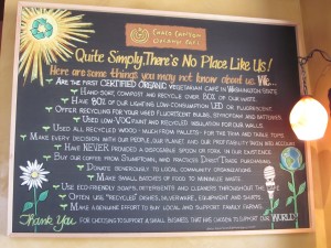
Chaco Canyon mission

Chaco Canyon West

To summarize what I found, the audiences they described were of mixed demographic, often educated and health-oriented. The colors they described for the movement ranged from earthy browns and greens to bright vibrants of lemons, oranges, and avocados. No symbols particularly stood out, other than the fruits and vegetables themselves. Creating salacious mystery would be a tricky thing. They didn’t see anything sexy or mysterious about raw foods, other than the fact that people who eat them are often attractive because of their outstanding health.

Thrive Café

So I narrowed it down to the colors of lime/avocado green, red and orange. They would be bright. As for the salacious mystery, I decided to capitalize on the word RAW and how many different interpretations can come from that, both mysterious and lascivious/carnal/raunchy/spicy…. here are the images I came up with:

Printing it up…

Researching the printing options, the results were varied…. www.printingblue.com offered custom stickers, and although they did offer free design, they had their own format, which wasn’t conducive to the custom version I was looking for. Their cost was about $185/100 3″ round stickers. In speaking to them to get quotes and timing, they said the turn around time would be about 10-12 business days. Then I found Zazzle.com, also an online store, couldn’t find where they were based. They charged $4.95/20 3″ round stickers. Couldn’t figure out how to contact them, to find a turn around time. For the custom sticker, I got as far as entering words on the design, then it asked me to log in, so I stopped. On to the next option…  Advanced Labels NW who said they had a minimum order of 500, would need an electronic file, and were up to a wait of 10-15 business days for turn around, once the design was approved.

So the Adanced Labels guy recommended Lightning Labels out of Colorado. They claimed that their digital printing was cheaper, yet their basic quote for 100 3″ round stickers was $279. They did boast a 3-day turn-around time. They asked for Adobe Photoshop or Illustrator, which is where I fall short in technical skills.

This project hasn’t gone viral yet. In order to make it happen, I need to complete the making of the sticker itself. This process has also confirmed what I already knew, and underlined why I am in school…. that while I may have good discipline to work, persistence to finish things, a good sense of aesthetics and composition, as well as a good understanding of principles of 2-D design, this project has highlighted to me that I am new to the field of contemporary graphic design, and have many technical skills to develop to create any kind of graphic design in any format other than manual. Timing is also crucial in any project, and getting to know turn around times for printing, processing will come with time (no pun intended) and experience, in order to make the work more effective.

Some Museum Versions of Graphic Design

One could hardly find two more different museums that the Henry and the Burke. Where one is for a select crowd, the other strives for inclusion of all…. where one is obscure in its mapping, the other is straightforward and clear…. where one uses mostly sans serif font, the other uses serif…. where one is sparse in decor and density, the other is stuffed with information and displays…. where one is a fine art gallery, the other is an interactive museum…

Henry Art Gallery entrance


Burke Museum entrance

I think each is relevant to its respective target audience, and that answering the questions below does indeed make a difference to the design.

1. How well does the design address the varied demographics that use the museum? Who goes here?

2. What assumptions do you have about the work in the museum and the nature of the museum itself?

…and as such…. how these museums address font, typography, lighting, density of displays, and layout are connected to the above answers.

For the Henry…

My impression is that it’s designed for people over 18 years of age with a higher education. The focus is on the art pieces themselves, and less so on the information about them. I found the explanations, such as the introduction to the Talent Show, easy to walk by (without noticing them). I found myself backtracking though, and looking for the explanation of the display because I didn’t get it on first glance, due to the varied artists, themes and media.

The density of display is low so that the depths of the ideas behind the works have more room to move around the space. The hallways are also bare. I think it’s because the target audience wants to think for themselves, and not be bombarded with a bunch of clutter, leaving more room for open interpretation. Color, along with this, is simple and limited to greys and wood tones.

Henry low-density display
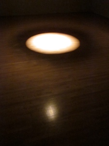
David Lamelas's spotlight - simple yet deep

Henry bare hallway

James Turrell’s Light Reign is the epitome of the Henry – simple, elegant, using the natural to create art, and with minimal words…

Light Reign

There was one exhibit entitled “Inspiring Vision: Looking at Photography” that  contradicted the message it was trying to get across, with mere placement. In its explanation, it said, “everyday looking is fast-paced, but looking at art takes time – deep looking to achieve awareness and understanding requires thoughtful reflection.” It was staged in a hallway with an echo and traffic flow, hardly conducive to reflection or pause.

The wayfinding was minimal, probably because the they think the target audience doesn’t need much guidance, and will find their way around.

Henry wayfinding

Lighting is focused on the works themselves with spot lights or track lighting, and the remainder is either natural lighting or darkness. Minimalist and simple. The font lines up with the themes of simplicity and sparseness, with its sans serif motifs.

Font at the Henry

To add to the exclusive feel, there seem to be a lot of closed doors, only accessible to staff.

staff only

All in hall, the Henry Art Gallery is cohesive in its intellectual, higher-end, modern (I mean that :o)), exclusive feel. The website isn’t however… it is cluttered and uses serif font, which makes for a different vibe from the gallery itself.

For the Burke…

The Burke seems to be aimed at all ages with its varied kinds of displays and information presentation within those displays. It is especially geared towards families with kids, or schools. The educational component is high, so the density of information is also high. As compared to the Henry’s one newspaper available at the entrance, the number and variety of handouts at the front kiosk exemplifies that they are working to reach many audiences, with a handout for each.

Upon entering, one gets a more welcoming sense than the Henry, along with a little kid humor:

Burke welcomes dinosaurs!

Part of the welcoming feeling comes from the serif font, and part comes from the lighting that is more orange in tone, kind of homey. The labeling and way-finding is more explicit – making it such that a kid could find her way around. It is also of multiple textures and levels, from the waist-level tables up to the ceiling with stuffed birds. It’s an all-encompassing full-body experience. There is visual stimulation, sounds, stuffed animals to touch, buttons to push, magnetic poetry, and puzzles. I guess the only sense missing was smell – maybe that’s a good thing. Along with this, I could be wrong, but I remember the lighting being more general than the Henry, because there was so much to look around for.

stuffed education to play with

The introduction in the Owl photography exhibit is central, right in front of you as you come in, can’t miss it. This supports the idea of obvious way-finding and explicit directions. The remainder of the information is presented in small chunks, for the short attention spans of their target audience.

The Biodiversity exhibit is also multi-textured and multi-use.With a variety of paintings, 3D sculptures, books, rocks with flashcards, a periscope and sounds.
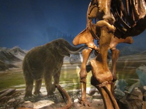
multi-textured displays

The graphics used lots of colors, for the intended audience. They got a little carried away with the c0lor-coding of the display graphics, however, which detracted from the information. Each of these “Where’s Washington” signs came color-coded with it’s theme, and the theme in turn used that color font in their titles, but it was too subtle and too varied to make for useful coding.

this sign came in green, blue, red, orange...

green title goes with green "Where's Washington" sign, and so on...

One poor example of the coloring in the signage came not with the color-coding, but in the sign itself, because of the values of the font vs the background.

confusing value

The stairways were full of art, always something for the audience to look at…

And downstairs, the Pacific Voices, that was displaying a variety of populations, just like the Talent Show, chose to represent it with many colors and varying font. Note the contrast in the titles of these exhibits, although they are each aiming at expressing many people’s voices…

colorful "Voices" of the Burke

monochromatic & uniform "Talent Show" of the Henry

As a side note, both flows of the exhibits were to the right of the title. Reiterating the difference in way-finding, the Talent Show explanation was on a wall to the left of the title, out of the natural flow of one’s experience. Note in the picture above, of the Voices, how the explanation is to the right, and part of the flow.

The exhibits within the Voices were elaborate, and with brief explanations.

Japan display
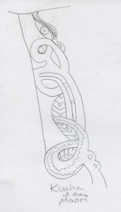
Kuaha of the Maori, on display

As a conclusion for the Burke, it too was cohesive in its “feel” for its intended audience, and while some of the graphics weren’t brilliant, it was nonetheless full of user-friendly information and guidance, aimed at a complex audience of a broad age-range and varied demographics. The website was consistent with it’s dense and informative material and diversity.

the wwweb connection

More and more, the web is intertwined with graphic design, as the web has become the main means for recognition & usability…. which means that the graphic designer needs to develop basic skill sets in web design and construction. Languages are a big part of that: CSS, PHP, HTML5, Flash (on its way out). With each language/system there is a different security and coding.

And because it’s a relatively new industry, the rate of change is super high right now as there is any time in the exploration of a new realm. And there are varying systems, Apple vs Android, for example (below). The key then, for the graphic designer, is MENTAL FLEXIBILITY. (Tony introduced the concept of “the Long Tail” – there are fewer people making a living but more people in the game.)

Gorilla marketing was a way to spread fast word, through physical/tangible means, and because of the web’s progressive presence, its concept has been incorporated to the web, with viral marketing.

The idea behind anything “viral” is just like an illness…. once it gets going, it goes fast and freely….Whether something goes viral or not, was originally spontaneous….. but marketers are picking up on that channel of “word of mouth” in cyberspace and creating intentional viral marketing…and so what it is that makes it go? why to people want to spread it (whatever IT may be)?

Common characteristics are in the emotional responses that they evoke… usually there are elements of humor, mystery, sexuality, spectacle and leaving people either wanting to learn more, or wanting to find some answer. It can be a hoax, can be controversial, or stupid.

Some of them are funny… like “Awesome Girls Fail,” an entertaining compilation of lots of accidents. Others are more serious, such as a Mexican teacher’s bravery among drug shootings.

T-mobile maximized the opportunity of the Royal Wedding (anticipation of an event) for their own version of the “House of Love” ceremony… which did indeed end up going viral.

Along with these new forms of spreading the word, and working through the internet have developed the web-version (internet, email, etc.) of etiquette, otherwise known as “Netiquette” (network etiquette). Entire websites are dedicated to this. They are pretty straight forward, and remind me of “everything you ever learned in kindergarten…” although a little more formal – with references to facts and documentation, which don’t matter so much in a sand box.

With web becoming a main means of recognition and usability, all of this matters to graphic designers. The web is intertwined with graphic design heavily now, and so a basic skill set with web knowledge, languages included, is essential.

Blue Collar Marketing: The Everyman Paradox

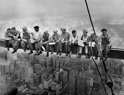
With a British background brought with the Mayflower and its sister boats, the elements of a society based on class (just witnessed with the royal wedding) still trickled into early US-European culture, and the working class was easily distinguished, as in the picture above.

In the article Working Joes and the Shadows of Capitalism they describe the working class living from check to check, and the idea of planning for the future being irrelevant, making the present moment the time to live fully.

” The working class is united in the great depression that is life, bounded by insecurity and dissatisfaction and grounded by a common distaste for the status quo and their inverted reflection of what they wish for but simultaneously never want to be- the dreaded, conforming, assured, amnestied, calculating, time obsessed, aura-less, ghost that is the Yuppie.”

According to this article, there is an essential difference between the Yuppie and the Working Class where the Yuppie is going towards a future goal of stable job, house etc… but exploring various places to go, where the Working Class is living more in the present because of either unstable job or economic situation, and encounters stability in the kinds of jobs (with repetition) and in frequenting the same places.

The pub is a classic place where that kind of stability is found. In researching working class imagery, the most frequent colors found seem to be red and black, just like the logo above. To further support that, here is a picture of one of my neighborhood pubs:

note the colors...

There is still an edge to the term working class – check out this working class streetwear: http://www.workingclassstreetwear.com/index1.html

Over the years the US has experienced a mixture of cultures that has in turn also mixed with a broadening of the working class, confusing it with an all-encompassing middle class. There has been an evolution of a paradox where no one wants to be poor and yet no one wants to seem elitist either. There is question among the experts as to Who or What is Middle Class. As that NBC article describes, “[data] aside, being “middle class” in America today appears to be mostly a state of mind.”

It seems that the absence of women is a part of the depiction of middle class, and yet the role of women has expanded. In addition to the expectations that they be beautiful and be mothers, they are also expected to work… thus the development of the powerful image of the tennis shoe congresswoman, Patty Murray.

Products for the middle class tend towards being colorful…

Frito Lay (although there is a definite shift towards more natural, subdued colors to capitalize on the “healthy” market.)

…the Clydesdales of Budweiser representing hardwork,

… and apartment therapy (saving the world, one room at a time) all provide colors that appeal to the middle class aesthetic.

The colors of the “discerning” palette are more subtle…. of beiges and off-whites. Eileen Fisher is a good example of these subtle hues, as is the Fairmont Olympic Hotel in Seattle.

Hierarchy & Grid

Power and Structure – they can do a world of good….

In the case of hierarchy, a clear delineation of power can help the reader sort through information. Hierarchy, as used in visual design, essentially is the order of importance in the depiction of information. As described in our textbook, Graphic Design the New Basics, “visual hierarchy controls the delivery and impact of the message.” This can be done using clear delineation between levels, page layout, changing size and color of font, placement on the page, organization of images in relation to lettering, background colors (balanced with the absence of), etc… because without depiction of hierarchy, the information can be confusing. It’s the designer’s job to organize information, and the use of effective hierarchical presentation can make the reader’s job easier. It can also guide the reader in the direction you want them to go.

playing with power

As in this example to the left, the title draws the most attention due to size, placement and bold lettering, and if the image in the center were color, if would be the first attraction…. then the eye glances over at the grey square of text, and finally to the BOLD title and the article iself.

Below are some examples of visual organization, from pg 123, of Universal Principles of Design (Lidwell, Holden & Butler, Rockport Publishers, 2003)

Trees, Nests, Stairs

Typography in its various contexts can play into hierarchy easily. Sizes, colors, whether it’s italicized, bold or regular, font, etc all play different roles in the power structure of a design.

In the example down below, where does your eye go?

In the case of the grid, it is essentially a structured field that helps organize the information/content in margins, columns, squares or circles, or at least organized visual chunks that can create a pattern that the reader can follow easily.

The two of them, hierarchy and grid, often work well together.

Aesthetics of the Extreme

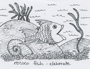
The excess spectacle that characterizes the current Extreeeeme activities is a touch different from the Rococo of the late 18th Century. They are both over the top, and both underscore the concept of horror vacui – where no place is left undecorated. Some described the Rococo style of art and decoration as frivolous and ornate, often excessive. It came to light in the reign of Louis the XV. It was seen as a time of luxury (for the elite), as depicted in Francois Boucher’s painting below. For furniture and walls, artists based their designs on shells and plants. While the colors of the Rococo times were rather pastel-based, those of this Extreme time is more of full saturation.

Marquise de Pompadour 1756

The Rococo times were based on leisure and luxury, but the Extreeeeme is based on adrenaline. We are continuing to explore limits – of ourselves and what is possible, and the adrenaline that comes with it is a large part of this concept. Yves Rossy of Switzerland is one such example, calling himself the Jetman, as he soars over the Grand Canyon flying 90 miles an hour in a jetsuit.

Front flipping on a motorcycle is another example.

Spectacle is part of it, but the adrenaline rush is as well. Some of the games with this are the Xgames, cliff jumping, sky diving, etc…Along with these activities of course come the drinks that support those in the middle of it, Monster, Red Bull, etc..

Aesthetics could be summarized with full saturation, distressed typography, heavy outlines, provocative subject matter, taboo material, and heightened lightning. Also, horror vacui is back – filling in alllllll the spaces it can find to fill. Part of that comes from marketers taking any opportunity they can to advertise. The extreme advertising goes hand in hand the the aesthetics.

As I was riding a bus the other day, I noticed it had a sense of calm, and I realized it was because there were no adds inside! Check this out – plain and simple – very rare these days.

"the ABSENCE of images is what stands out"

More examples of the extreme can be found with Lady Gaga and her new album, the recent movie “Thor”, and many other 3D action movies.

At a different pace, but extreme in its own right, almost going full circle back to the Rococo fluff, Nicole Dextras is using plants in extremely new yet old ways… http://shine.yahoo.com/event/green/weedrobes-artist-creates-stunning-garments-from-fruit-weeds-flowers-2482173#photoViewer=1

As well as the art by Edgar Mueller in creating 3D illusions on the streets… http://news.yahoo.com/nphotos/3D-Street-Art-Edgar-Mueller/ss/events/wl/0513113dstreetart