Category Archives: Graphic Design

A Brief History – the context we are working with

In order to get a sense of where we could potentially be going in the world of (essentially western) design, this week we took a look at where we came from. This context can ground our ideas and be a means to more accurate prognostication.

With the birth of industry, science, political science (constitutions for newly-independent states) in the 18th century, there was a new development of forward thinking, belief in potential progress and a hope for the future. With the new insights that came from these new fields, there was an optimistic perception that everything would eventually be known, diseases would be cured, and we would reach a common utopia full of great pleasure and leisure.

These were the roots of modernism, a break from tradition and a look toward the new. This also changed the role of art in society. Where before art was a reflection of the definition of beauty, a depiction of nature, and a reflection of cultural values, its potential opened up with the advent of the photograph and the development of science.

In Leonardo Da Vinci’s time in the 15th century, part of art was to explore nature. He explored anatomy of humans as well as plants to better understand their structures, and he drew his findings.

He also studied motion through drawing…

Not all agreed on how the utopia of modernism would be reached, but there were two parallel camps, namely the Rationals and the Empiricists. They were accompanied by the philosophical camps of Voltaire (& Rene Descartes) and Rousseau (& Francis Bacon), respectively. The former believed that knowledge was acquired through pure thinking, and believed that if people could fix their emotions they could fix everything. The latter, by contrast, believed that knowledge was acquired through direct sensory experience. Neoclassicist and Romanticist artists in turn reflected these two parallel trains of thought. Where the Neoclassist tended toward realistic depictions of their subject matter, the Romanticists focused more on conveying the feeling of the experience they were depicting. Chiaroscuro was a common technique for the dramatic desired effects among the Romanticists. They believed in the transcendent experience of life, those moments as Tony described them, when “life opens, time dilates, and you become what you are looking at.”

Neoclassicist Bernardo Belotto:

Romanticist Francisco Goya:

Modernists developed a sense that they were breaking from tradition, that they were going to create art that would change the world, and that they would be the ULTIMATE art form. Words to describe them could be, “experimental, avant-garde, forward looking, elite, and confident. In the early days of modernism, there was a striving for reduction of form to its pure essence.

A Modern bedroom:

Within the modernist movement is the idea of Utopia and its perfection, as mentioned previously, and this is parallel to consumerist culture, striving for the ideal.

But Utopia never happened, and people were still sick, and society was still messed up, and the expected progress didn’t make the ultimate difference that had been so optimistically anticipated, which gave way to Post-Modernism. Post Modernist thought broke from the objectivity and progress of Modernism to a belief in multiple realities and subjectivity. With this came a transfer of power from the creator to the viewer. It was a culture of language and called into question the power structures of the time. There was room for playful illusions and a generous use of irony.

Essentially as a culture, we gave up on trying to make pure new any more and gave up trying to make things better. The only way to create new was now to combine the old into new contexts, to combine styles.

On this Jan/Feb 2011 cover of the Utne Reader, adding Marge to replace Howard Miller’s Rosie the Riveter from World War II is a classic example of this mixture. Another example is of Michelangelo’s Sistine Chapel painting “The Creation of Adam” transposed to a bottle of 2009 California table wine, God’s hand being the one with the wine…

The fact that a designer could transpose a divine event such as the creation of Adam (that took years to paint) into a wine label emphasizing ordinary daily life is an indication as to how removed the original meaning is from the current one. Or it could also be an example of how religion has lost some of its mystique.

As for the post-modern fish, it could be found in Dr Seuss’s book, One Fish Two Fish Red Fish Blue Fish (1960), where he puts fish in all different contexts – having them drive cars and be police officers, nothing that a simple modern swimming fish would ordinarily do…

The 1960’s saw the beginning of the blurring of the lines between life and art, with the development of the moving picture and the video. The movements of Dada and later Fluxus emphasized an anti-establishment approach. On into the 90’s the development of further art forms and technology such as the internet and computer graphics continued the complex potential of multimedia performances.

Body art is a simple version of performance art:

The versions of versions of versions of postmodernism has paralleled a removal from reality from virtual experiences. Video games exemplify this virtual experience of life.

Many visual arts such as movies, video games etc are being made into three-D, which people find fascinating – but which is also funny because we LIVE in 3-D – how cool is that?! Maybe it’s the fascination with human-made 3-D.

And while corporate culture still believes and sells the utopia of modernism and perfection, post modern culture as a whole does not believe in it (even if we still get sucked into shopping for the marketed lifestyles!)

New Media arts are contiguous with keeping the viewer integrated in the art experience, and are often interactive in nature. They are also often performance-based.

Just this past week we went to Pottery Northwest in Queen Anne, where they had an experiential show with three different artists… one who allowed the audience to break off pieces of a tree she had made to take home, one who had a slip pendulum show, and the third who had letters that fell and broke… all very interactive with the audience.

More technology-based examples could be this:

For conferences…

http://www.gesturetek.com/illuminate/productsolutions_illuminatekiosk.php

…or fashion shows….

http://fashionista.com/2010/09/gucci-launches-interactive-fashion-show-technology/

laser shows

or even 4-D

… and then there’s my personal favorite… fire poi … a dynamic performance art that is not so new, but it is still gaining skilled spinners…

http://youtu.be/OQJdmOhSsXU

Branding Comparison Exploration

This is a summary of a series of stores we visited last week, on an exploration of brands in combination with vibe and product. Featured stores include Columbia Sportswear, Eileen Fisher, American Eagle, Anthropologie, and Allsaints Spitalfield.

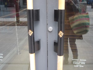
The first store we went to was Columbia Sportswear, on 3rd & Pine, because it’s so dominating, with its bright colored banner and many videos. Upon entering, the Columbia logo is on the wooden door handles. There is a poster just inside with a woman scolding you for being inside.  The materials on the inside of the store are all faux natural – giving the illusion of stone and rock and wood, with carpets with wave patterns.  The carpet upstairs is green, as if you were up in the tree.  The music is grunge-like.

On first appearance it’s neat and organized. There are many quotes about inclement weather, such as “we believe things should be un-cancelled due to inclement weather”, and “we believe bad weather should be celebrated daily,” yet their color of choice for their banner is the bright blue of blue skies, or clear weather and clear water. I find this contradicts their words, thus giving them less value to their message.  They have a lot of word phrases about “trying” and “fast” – it feels like they are “trying” too hard. The atmosphere is rather uptight and rigid, kind of east-coast like, and the staff follow you around, smiling uncomfortably as they “rearrange” the hangers. It seems like they are playing toward the appearance of hard core, with of course the touch of environmental awareness on some posters around the store.

No pictures allowed (oops). Lots of videos of people wearing Columbia Sportswear smiling and running outside, with quotes about being bold, technology, winning etc…  Products are clothes and shoes.

Their main clientele seems to be 20-40-ish – active people who are straight-laced and driven. I would imagine that the store exemplifies what they are aiming at, in the “natural look” and the clean feel, with the idea that their target audience will be drawn into a world that will bring out their motivated characters and support the high tech approach to the outdoors that they want. These people don’t connect to nature or relax there, they maximize their performance in nature. They want to look good while they get in shape with their fancy clothes. They appreciate the cleanliness of the fresh air as they breathe harder while they run, and they want gear that’s going to allow them to go fast and light, and keep up with their fast-paced lives.

Our next stop was Eileen Fisher – 6th & Pine. The outside of the store is simple, elegant, with beige and brown coloring.  The simple, sans-serif letters match the design feel. Just as we walked in, a woman who seemed to be the target audience walked in front of us – a woman in her sixties, well-dressed with a scarf, red-lipstick and a carefully maintained grey hairdo.

I imagine that “she” is well-educated, and has a little extra disposable income. She has a consciousness about how her dollars spent affect the world, and she wants to support companies that are socially conscious as well, as part of her vote of where the money should go. She expects high-quality materials, and her presence embodies the words they use to describe the products down below. Sure enough, as we were browsing the $400 handkerchief linen garments, we overheard her talking to the friendly sales associate about how she had three of the shirts she was looking at purchasing in a different color. The colors of the clothes are subdued and limited, the designs simple, sophisticated – words they draw from the website are “simple, sensual, beautiful, timeless, functional.” Each wooden hanger has her name engraved in it. The font is simple.

The atmosphere is quiet, and we whisper our comments to each other, so as not to make too much noise – I don’t remember if there was music. No smells stand out either.

It is a line geared for an older woman with disposable income who is interested in style and high quality materials and interested in sustainability.  She is loyal to her brand. “Pure shapes and fine fabrics.” Incidentally, when I went to the website, the picture of Eileen Fisher looked a lot like the woman we saw in the store. (www.eileenfisher.com)

Moving along, we looked for Forever 21, but it had moved, so we decided to dip in to American Eagle instead. (As a side note, I noticed that this was the third corner store we were entering – location, location, location.)

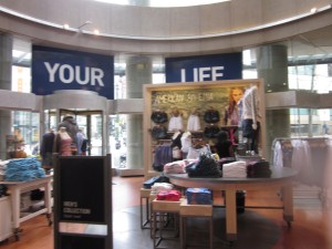
The outside of the American Eagle store is a bold navy blue and gold, on 6th & Pike. As soon as we entered, we were greeted with loud pop music, cheerful and casual. Big windows, natural lighting. On the walls there were two huge pictures of gorgeous bronzed people in their 20s. Riding the escalator up to the second floor, Emma immediately said she liked this atmosphere best – where it’s okay to make noise and things are a little disorganized. The clearance section was big and mixed up. Adjectives we would use to describe the atmosphere would be hot, fun, active, casual. The photo shoot was in Costa Rica – fun, friendly and beautiful, warm. Lots of waterfalls, sun and plants. She knew about it from their website.

The clothes are colorful, and there are large words on one of the blown up pictures that says, “American Bohemia”, which sums up the target audience, and I interpret as youth in their 20’s. University students with free-flowing attitudes, and aimed at a non-conventional life, certainly not office jobs. They want to feel like wanderers, although they may not actually be. I didn’t notice in the store itself, but then later found on the website the whole selection of kids clothes, that would speak to young parents who still want to be a part of the adventure of life. Maybe they’ll go to Costa Rica with their kids on the next vacation.

The selection, abundant – soooo many choices. The staff were super friendly and seemed genuine, not monitoring what you’re doing (like in Columbia), but just trying to be helpful. We actually spent a bunch of time in that store, as it was comfortable, relaxed and easy to hang out in – since there were couches and loud music, so you could just melt in to the environment. This was the first store where there were comfortable places to sit.

We then moved into the street entrance (not corner) of Diesel. No places to sit, and rather quiet in comparison to the American Eagle. The first words we saw inside were above the shoes on the entrance wall that said,

“Not Made for Running.” The general message to the Diesel crowd seems to be, “don’t move, stand there, be cool.” Geared toward urban living. These people don’t go outside, nor are they interested in exercising. They probably do pay attention to what they eat though, or maybe they smoke, because they want to maintain their figure for these clothes. The lighting is a dim grey. The staff were a little aloof.

There were mannequins with either no heads or just legs with short shorts and high heels. The jeans are a forced worn-out look, which I think they are terming “powderful”, which of course I mis-read as “powerful” at first glance. The posters of both men and women had some kind of covering over the heads – whether it was diesel or colored clouds. Overall a feeling of dehumanization, or self-destruction.

Next down the same street was Anthropologie, which upon entering immediately bombards you with sweet fruity smell of some sort. As we wander around the store, the smell becomes a little overbearing. The décor is tropical, or of a travel feel – wood and grass. Even the white security scanners at the door are covered in burlap. Many colors and combination of styles throughout the store. Seems to be aimed toward the wishful world traveler. It has a little bit of “Out of Africa” feel to it. A little house oriented too, because it has household items in addition to the clothing line. There is a hand-made/casual feel to the products, a little along the fun side. A little pricey though, for the casual appearance.

I find their feel a little contrived, and their look not totally coherent. (www.anthropologie.com)

The final stop was Allsaints Spitalfield of London – for the urban, contemporary, grey, industrial crowd. More friendly and human than Diesel. The store is like a warehouse – high ceilings littered with black track lighting, lots of chunky lights. The windows are full of old singer sewing machines to give the appearance of old quality. Colors are black, grey and some oranges and pinks. The clothing is a combination of textiles and varying textures, including beads and embroidery. The sales rep I talked to was very enthusiastic about how the style was new, classic and contemporary, but seemed to fit well with Seattle, and how they were opening new stores in Chicago and DC by the end of the year.  It does seem like a look that combines a bunch of styles, and could do well here urban, funky, creative, grey.

When I looked at the website, it looked like something we had looked at in class.  (www.us.allsaints.com) Their website has the option of the simplified version for your mobile device!

Branding

Branding is basically an identity – a symbol or name or even color that identifies something, which started out in simple terms like cattle and wine barrels, literally branded (burnt).

(The contemporary wine barrel companies of course boast the historical connection to branding, but include up-to-date mobile graphics on their websites.)

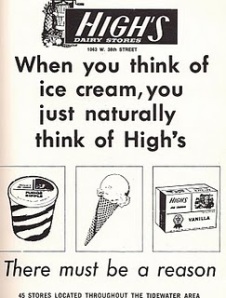
When graphic designers first started marketing brands, they focused mostly on the product, and what the product did. Simple graphics. The intention was to help customers recognize products. Here is an example:

Gotta love sugar.

As time passed, however, the brand identity began to expand to the company producing the product and the services it provided. Companies such as Ford and McDonald’s focused on customer service as well as product. The golden arches have created a lasting image that you can find easily worldwide, and recognize from afar, like from the top of the Seattle Space Needle, wow, when I get down, I really want a burger.

The signs of a good brand (a well-selling one) are something that is easily recognizable, easy to spot, and distinctive all at once.

Here are some examples of brands from the top of my head. They may not be accurate, but they are the symbols that stuck…A brand name has always been indicative of an identity, and that identity has now expanded beyond just the product to a whole life style. The brand marketing today encompasses music, smells, lighting, and attitude that accompany the marketed product.

Examples are the cologne at the entrances to Tommy Hilfiger stores and the racy pictures that go with it, the sporty lifestyle that Mountain Hardware endorses, and the sophistication of Eileen Fisher clothes.

Alchemy Goods is a Seattle-based company that makes bags of various sizes and works with a large proportion of recycled materials. Their name has multiple meanings. Besides the obvious acronym of AG (Alchemy Goods), it also represents the element of silver, and although silver is #47 in the periodic table, they put the #67 imitating the periodic table, which instead represents the percentage of content that is recycled. This is also geared toward a particular attitude in their customers.

Interestingly enough, although brands market an ideal lifestyle (a modern concept to be elaborated on in a later blog), the buyer does not necessarily experience that when they buy the products, because all they go home with is a pear of jeans, not the lifestyle. This can lead to disappointment, or it can also inspire buying more…

Over the years, the public remembers brands, which is why, especially in hard times like now, it’s easier to re-market old known names, rather than start fresh. Here are some examples of some of those revived brands, to continue marketing into the present day in this Forbes article, Old Brands Pitch Stability, Integrity.

When creating a brand, the most difficult part is to produce consistency with the message. In creating a brand, it’s best to go through an elaborate briefing process before even diving into images.  Defining the target audience, the competition and other relevant examples, the name to be marketed, the scope of the project and strategies for customer outreach are all part of developing a cohesive brand.

Here are some examples of the development for the TRAC logo that we created in our group project – aimed towards 25-40-ish tech business professionals. We ended up chosing the upperleft, which combined clean with a practical depiction of the philips head screwdriver.

“Cohesive” can come to the detriment of atmosphere however. The National Outdoor Leadership School (NOLS) has had many branches throughout the world, and historically each branch would add their extra flavor to the NOLS logo

The Alaska branch added the big dipper, the southwest branch added a cactus, the Patagonia branch added quila etc. But around 2005 they hired a new Director of Operations with a business background who was so determined to brand the school, that they prohibited any alterations of the logo – this created much resentment at the branch level because of the formalities imposed, and they felt like the diversity that the school encouraged was being stifled.

Most logos adapt with changing times… Burger King has gone from a stagnant burger, to one that includes elements of the illusion of motion.

Applied Design

Historically cultures were mostly geographically isolated, which meant that their cultures were defined by a cohesive system of intertwined aspects of life, such as food, dance, music, dress, entertainment, architecture, and fine art reflected these, as well as the values, discoveries and politics of the times. But everything is so intertwined geographically these days, that sometimes, someone in Kenya who is of the same age and class as someone in Belgium, could potentially have more in common with each other than others of the same nationality.

The adds and website for the Columbian (and largest spanish speaking) cell phone company Movistar aren’t so different from a site for Sprint or Verizon other than the number of products and the difference in language… but they all refer to Facebook, Twitter and YouTube, and talk about minutes and similar-looking phones.

Given that most of us will be working in a western context, understanding the cultural and artistic evolution of that context can give us a better trampoline to jump from to create design. Nonetheless there is currently an element of global connection now that didn’t exist a short time ago, which infiltrates western design in multiple aspects.

One example of this is the article “The Big Red Word vs the Little Green Man – The International War Over Exit Signs”

It’s an article which exemplifies the complexities of creating “Universal” design, where the cultural nuances of colors, words and images play different roles in different contexts, yet there can be similarities too.

Applied Design, a field reflecting visual culture, has become rather intricate, where the graphic designer has the potential to created visual communication and influence in so many different ways. The expectations for the graphic designer in turn has also risen respective to the growing potential of the visual arts and its fast-developing new tools.

The list of examples of applied design – or design in action – is extensive, ranging from the classic logos & brochures, to exhibition displays, restaurant menus, travel guides, and signage…. and the list continues wherever there is a chance to create visual stimulation or organization, depending on the purpose of the design.

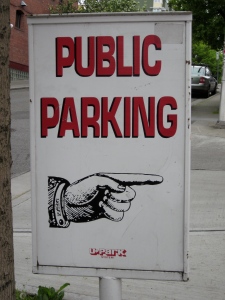
As a wilderness navigator, I am particularly intrigued by way-finding graphics, which inevitably incorporate some form of arrow:


Wayfinding graphics are not necessarily easy to do well – just recently a friend was looking for baggage claim carousel #15 at SEATAC, and the signage was telling her “Baggage Claim” with arrows in opposite directions – yet the carousels are a long distance apart, so she could have ended up going way out of her way since there were no numbers indicated on the sign. But wayfinding can also be highly entertaining and intentionally disorienting, as it is in Vegas.


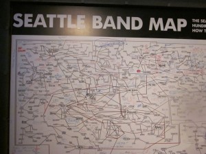
Maps are another way to visually portray information graphically, such as this band map at the EMP, one for overall Seattle, and another with Nirvanna as the focus:

Above is another map with 3D effects – created for directions to a restaurant.

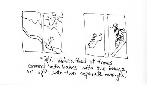
One of the considerations that has evolved in design recently is the creation of sequential images that create the illusion of motion. Motion is EVERYWHERE!! This can involve kinetic typography as well as a series of moving images that are integrated with each other.

Fun examples of kinetic type… from Johnny Lee, and hours of entertainment at http://kinetictypography.com/ (I like the “who’s on first” typographical video), to the poem by Taylor Mali, represented by “Typography” from Ronnie Bruce.

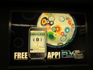
Another recent consideration is being able to create a visual design in multiple sizes as well as multiple venues, because of the different technological presentations and venues for the same product… from websites to phone apps, to board reports and posters.

In many cases, such as Facebook and Hulu, and WordPress, the logo has been simplified to a single letter: “f,” “h,” and “W” respectively, which is easily legible even when reduced in size.

Others have chosen to adapt their logos according to the audience that they are working with….

Here is an example of the original logo of the Mosaic Project, a non-profit organization that works with 4th & 5th graders to teach them about diversity and conflict resolution.

Home

The Mosaic Project logos

Recently they have developed potential staff trainings with the GAP, and for this work have adapted their logo as such, adding a business twist:

MCP logo with glasses

Along with the corresponding adaptation in the website, that still has the same Mosaic Project feel, but with more of a business twist: http://www.mosaicconsultingproject.org/

Just as this blog is a preliminary compilation of a broad and superficial overview of applied graphics, the first week was also a preliminary introduction, a good chunk of which was just spent trying to find the course textbook in the sea of electronic filing. As we explore the specific elements more in depth, so will this blog reflect a more in-depth perception and understanding of the greater field of graphic design.

… and to top it off, here is a fun laser show video…