This is a summary of a series of stores we visited last week, on an exploration of brands in combination with vibe and product. Featured stores include Columbia Sportswear, Eileen Fisher, American Eagle, Anthropologie, and Allsaints Spitalfield.
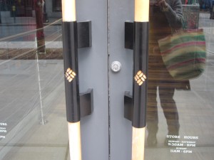
The first store we went to was Columbia Sportswear, on 3rd & Pine, because it’s so dominating, with its bright colored banner and many videos. Upon entering, the Columbia logo is on the wooden door handles. There is a poster just inside with a woman scolding you for being inside. The materials on the inside of the store are all faux natural – giving the illusion of stone and rock and wood, with carpets with wave patterns. The carpet upstairs is green, as if you were up in the tree. The music is grunge-like.
On first appearance it’s neat and organized. There are many quotes about inclement weather, such as “we believe things should be un-cancelled due to inclement weather”, and “we believe bad weather should be celebrated daily,” yet their color of choice for their banner is the bright blue of blue skies, or clear weather and clear water. I find this contradicts their words, thus giving them less value to their message. They have a lot of word phrases about “trying” and “fast” – it feels like they are “trying” too hard. The atmosphere is rather uptight and rigid, kind of east-coast like, and the staff follow you around, smiling uncomfortably as they “rearrange” the hangers. It seems like they are playing toward the appearance of hard core, with of course the touch of environmental awareness on some posters around the store.
No pictures allowed (oops). Lots of videos of people wearing Columbia Sportswear smiling and running outside, with quotes about being bold, technology, winning etc… Products are clothes and shoes.
Their main clientele seems to be 20-40-ish – active people who are straight-laced and driven. I would imagine that the store exemplifies what they are aiming at, in the “natural look” and the clean feel, with the idea that their target audience will be drawn into a world that will bring out their motivated characters and support the high tech approach to the outdoors that they want. These people don’t connect to nature or relax there, they maximize their performance in nature. They want to look good while they get in shape with their fancy clothes. They appreciate the cleanliness of the fresh air as they breathe harder while they run, and they want gear that’s going to allow them to go fast and light, and keep up with their fast-paced lives.
Our next stop was Eileen Fisher – 6th & Pine. The outside of the store is simple, elegant, with beige and brown coloring. The simple, sans-serif letters match the design feel. Just as we walked in, a woman who seemed to be the target audience walked in front of us – a woman in her sixties, well-dressed with a scarf, red-lipstick and a carefully maintained grey hairdo.
I imagine that “she” is well-educated, and has a little extra disposable income. She has a consciousness about how her dollars spent affect the world, and she wants to support companies that are socially conscious as well, as part of her vote of where the money should go. She expects high-quality materials, and her presence embodies the words they use to describe the products down below. Sure enough, as we were browsing the $400 handkerchief linen garments, we overheard her talking to the friendly sales associate about how she had three of the shirts she was looking at purchasing in a different color. The colors of the clothes are subdued and limited, the designs simple, sophisticated – words they draw from the website are “simple, sensual, beautiful, timeless, functional.” Each wooden hanger has her name engraved in it. The font is simple.
The atmosphere is quiet, and we whisper our comments to each other, so as not to make too much noise – I don’t remember if there was music. No smells  stand out either.
It is a line geared for an older woman with disposable income who is interested in style and high quality materials and interested in sustainability. She is loyal to her brand. “Pure shapes and fine fabrics.” Incidentally, when I went to the website, the picture of Eileen Fisher looked a lot like the woman we saw in the store. (www.eileenfisher.com)
 Moving along, we looked for Forever 21, but it had moved, so we decided to dip in to American Eagle instead. (As a side note, I noticed that this was the third corner store we were entering – location, location, location.)
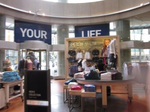
The outside of the American Eagle store is a bold navy blue and gold, on 6th & Pike. As soon as we entered, we were greeted with loud pop music, cheerful and casual. Big windows, natural lighting. On the walls there were two huge pictures of gorgeous bronzed people in their 20s. Riding the escalator up to the second floor, Emma immediately said she liked this atmosphere best – where it’s okay to make noise and things are a little disorganized. The clearance section was big and mixed up. Adjectives we would use to describe the atmosphere would be hot, fun, active, casual. The photo shoot was in Costa Rica – fun, friendly and beautiful, warm. Lots of waterfalls, sun and plants. She knew about it from their website.
The clothes are colorful, and there are large words on one of the blown up pictures that says, “American Bohemia”, which sums up the target audience, and I interpret as youth in their 20’s. University students with free-flowing attitudes, and aimed at a non-conventional life, certainly not office jobs. They want to feel like wanderers, although they may not actually be. I didn’t notice in the store itself, but then later found on the website the whole selection of kids clothes, that would speak to young parents who still want to be a part of the adventure of life. Maybe they’ll go to Costa Rica with their kids on the next vacation.
The selection, abundant – soooo many choices. The staff were super friendly and seemed genuine, not monitoring what you’re doing (like in Columbia), but just trying to be helpful. We actually spent a bunch of time in that store, as it was comfortable, relaxed and easy to hang out in – since there were couches and loud music, so you could just melt in to the environment. This was the first store where there were comfortable places to sit.
We then moved into the street entrance (not corner) of Diesel. No places to sit, and rather quiet in comparison to the American Eagle. The first words we saw inside were above the shoes on the entrance wall that said, 
“Not Made for Running.” The general message to the Diesel crowd seems to be, “don’t move, stand there, be cool.” Geared toward urban living. These people don’t go outside, nor are they interested in exercising. They probably do pay attention to what they eat though, or maybe they smoke, because they want to maintain their figure for these clothes. The lighting is a dim grey. The staff were a little aloof.
There were mannequins with either no heads or just legs with short shorts and high heels. The jeans are a forced worn-out look, which I think they are terming “powderful”, which of course I mis-read as  “powerful” at first glance. The posters of both men and women had some kind of covering over the heads – whether it was diesel or colored clouds. Overall a feeling of dehumanization, or self-destruction.
Next down the same street was Anthropologie, which upon entering immediately bombards you with sweet fruity smell of some sort. As we wander around the store, the smell becomes a little overbearing. The décor is tropical, or of a travel feel – wood and grass. Even the white security scanners at the door are covered in burlap. Many colors and combination of styles throughout the store. Seems to be aimed toward the wishful world traveler. It has a little bit of “Out of Africa” feel to it. A little house oriented too, because it has household items in addition to the clothing line. There is a hand-made/casual feel to the products, a little along the fun side. A little pricey though, for the casual appearance.
I find their feel a little contrived, and their look not totally coherent. (www.anthropologie.com)
The final stop was Allsaints Spitalfield of London – for the urban, contemporary, grey, industrial crowd. More friendly and human than Diesel. The store is like a warehouse – high ceilings littered with black track lighting, lots of chunky lights. The windows are full of old singer sewing machines to give the appearance of old quality. Colors are black, grey and some oranges and pinks. The clothing is a combination of textiles and varying textures, including beads and embroidery. The sales rep I talked to was very enthusiastic about how the style was new, classic and contemporary, but seemed to fit well with Seattle, and how they were opening new stores in Chicago and DC by the end of the year. It does seem like a look that combines a bunch of styles, and could do well here urban, funky, creative, grey.
When I looked at the website, it looked like something we had looked at in class. (www.us.allsaints.com) Their website has the option of the simplified version for your mobile device!


